- contact@sashaminh.com
- London
- Open for Freelancer

Barclays Bank is a British multinational universal bank, headquartered in London, England. Barclays operates as two divisions, Barclays UK and Barclays International, supported by a service company, Barclays Execution Services.
With 325 years of history and expertise in banking, Barclays operates in over 50
countries and employs approximately 135,000 people.
Barclays is driven by its Purpose and Values, drawing on its heritage and the core essence
of the brand. Its Purpose is to help people achieve their ambitions – in the right way,
and its values are Respect, Integrity, Service, Excellence and Stewardship
The banking sector is keen to develop new methods and embracing change through digital innovation to improve consumer user experience. Ranging from powerful mobile applications, native web apps to powerful in-store experiences through Kiosk.
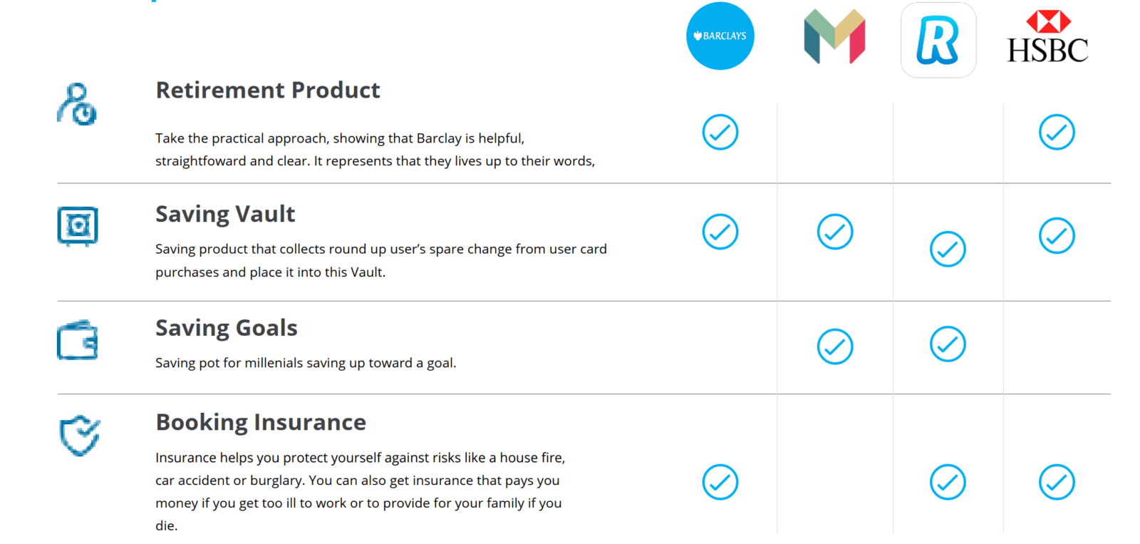
The global banking sector recently suffered from low-interest saving rates, therefore, require innovative solutions to encourage savers back into the market and save money.
The global banking sector recently suffered from low-interest saving rates, therefore, require innovative solutions to encourage savers back into the market and save money
Some common elements of written reports include headings to indicate topics and help the
We are using UCD methodology, every step is working closely to customers to understand
We are using UCD methodology, every step is working closely to customers to understand
The hardest part of the UX is not selling certain services,, but to educate non-user to know and comprehend clearly about the
products. Customer Journey map give us adeep insight of their journey, in order to figure out where are the touch points that we can reach
To identify current problems with the app. We conduct research on both sides from the organization to our customer

In depth interview with front line staffs (Bank teller, call center, customer services and marketing). Review customer online feedback survey
Conduct usability testing and field study with current customers
The hardest part of the UX is not selling certain services, but educating non-user to know and comprehend clearly about the products. Customer Journey map give us a deep insight into their journey, in order to figure out where are the touchpoints that we can reach

The hardest part of the UX is not selling certain services,, but to educate non-user to know and comprehend clearly about the
products. Customer Journey map give us adeep insight of their journey, in order to figure out where are the touch points that we can reach

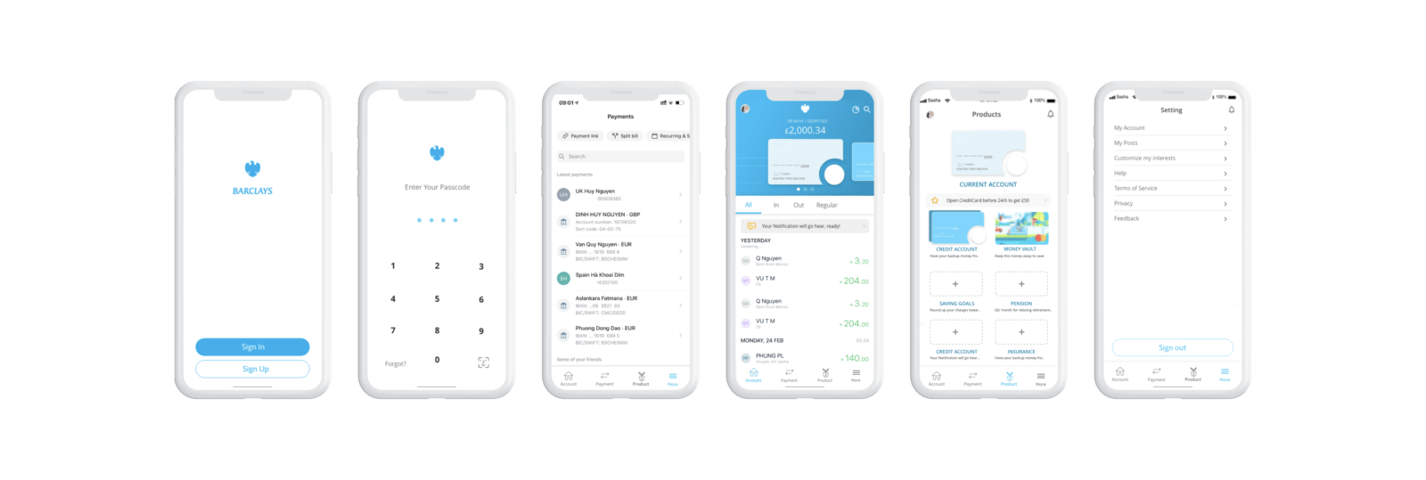
In order to bring the greatest result, the whole app should be reconstructed and re-apply its branding visual.
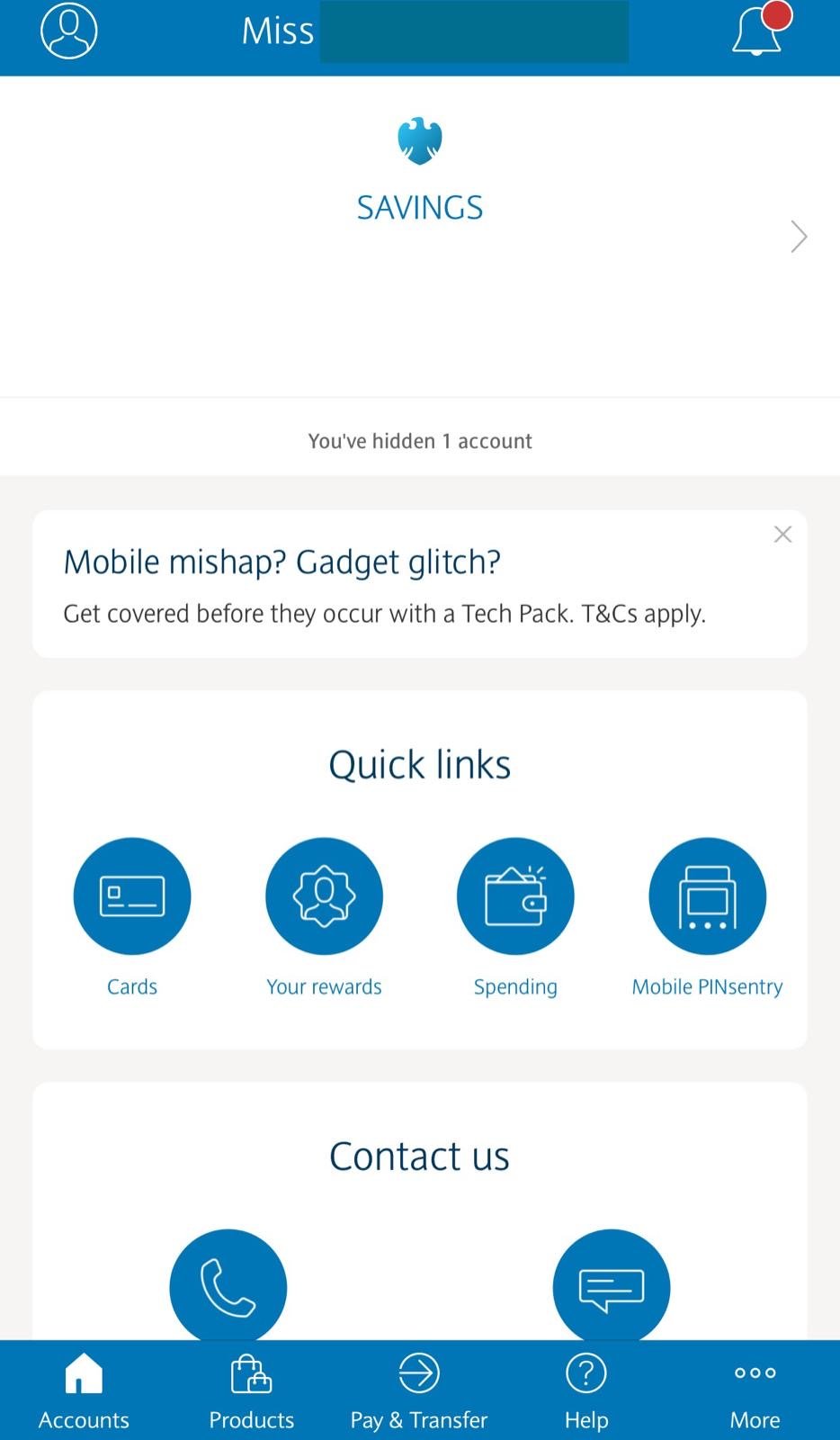
Homepage is a quick place for users to access and sort out their banking problems. This leads to the most important banking features that should be placed on the Homepage including Account Details, Card Details, History, Analytics, Profile, Search, Help..
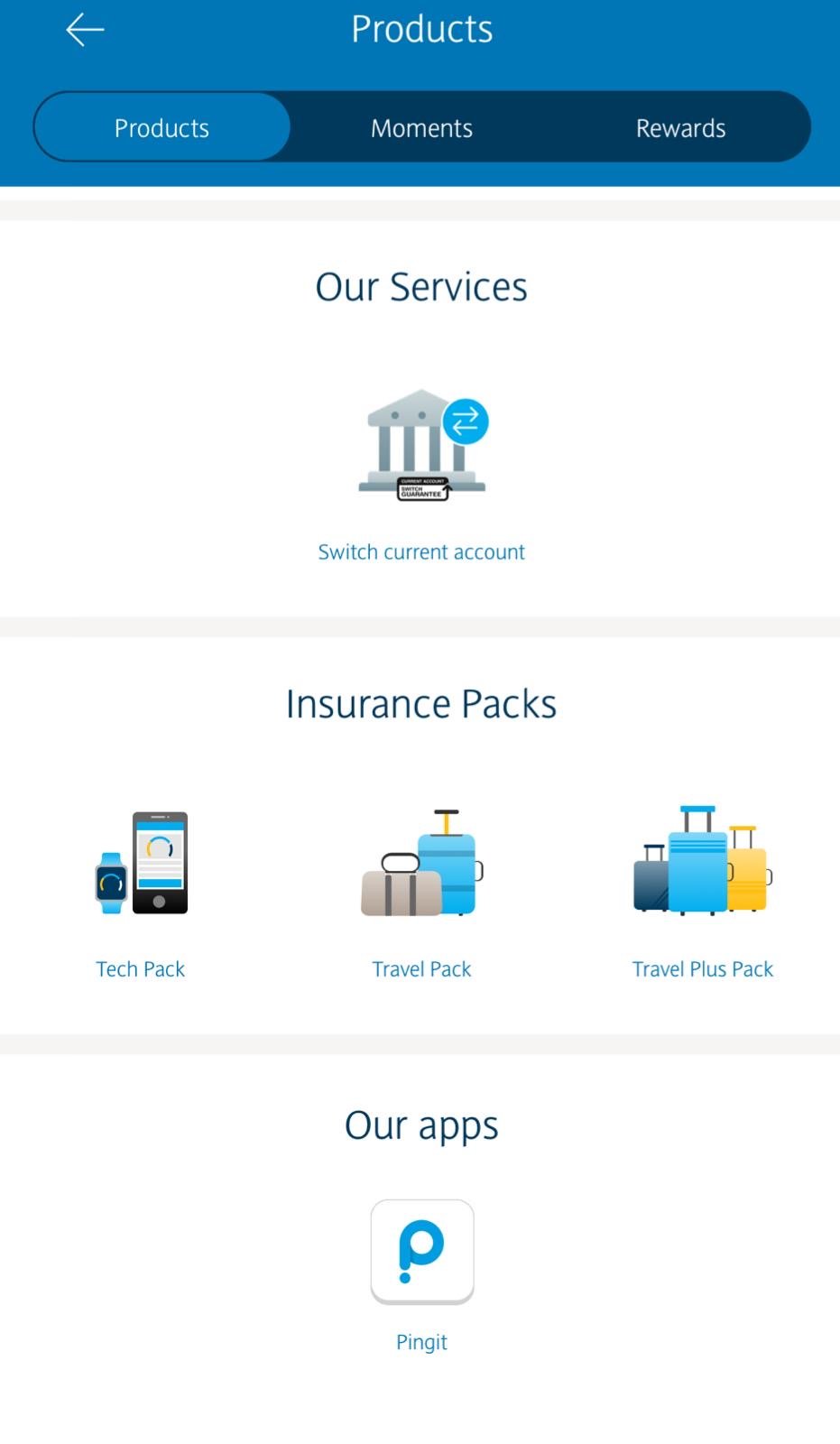
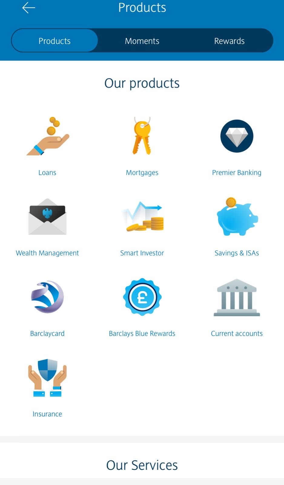
In the meanwhile, Barclay products is a new tab to showcase different banking products, encourage them to use it in near future: Current Account, Credit, Saving Goals, Vaul, Pension….
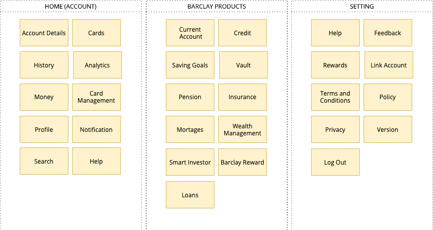
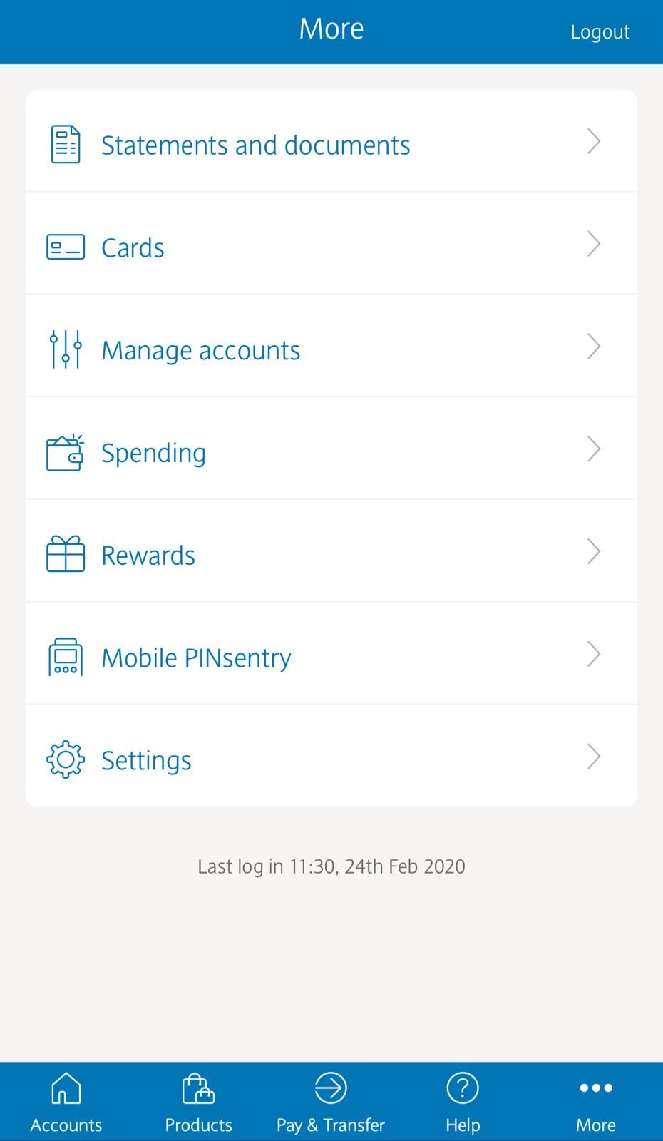
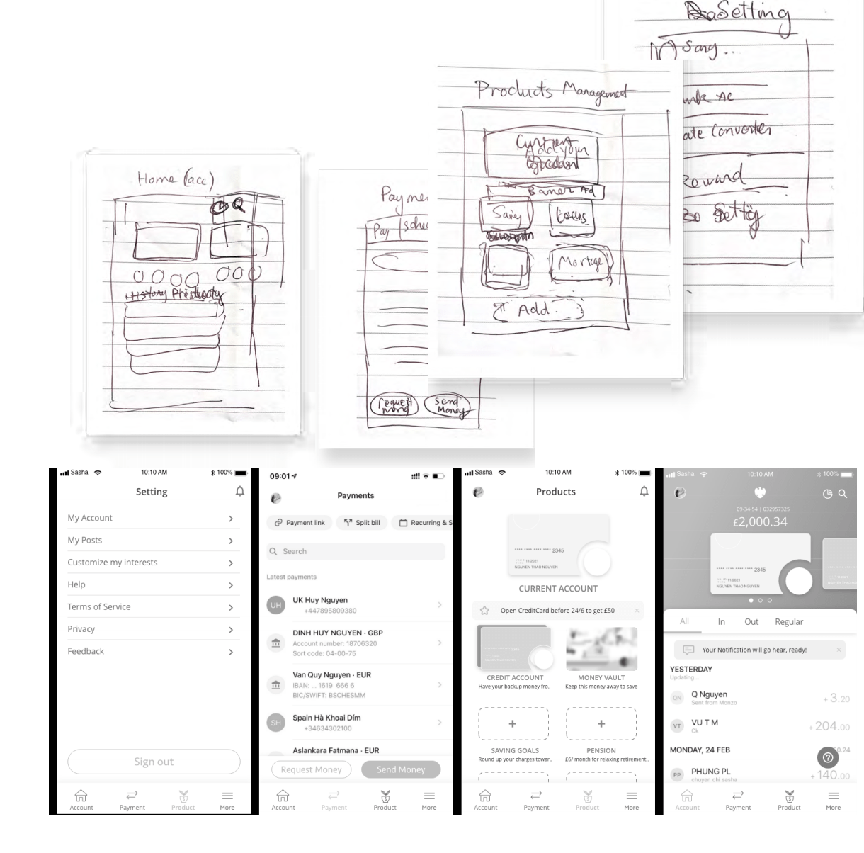
There are too many tabs on the current Barclay app version that caused confusion to users. The new site map has only 4 tabs, which are: Home, Payment, Product Management, and Setting.


Problem:How much money do I have? I need to manage my portfolio? Blue is everywhere, which one is a button? Where is…?
Solution: Easy to know the money and latest transaction, less frequent functions are moved up since it’s not a frequent banking task
Re-applied UI for a clean interface
Used visual assists storytelling instead of just wording.
Quick help assistant to assist users on every move
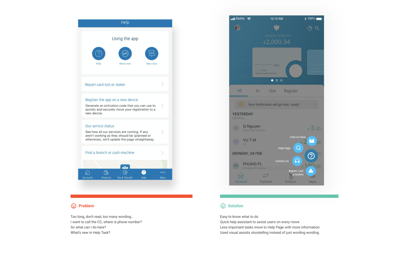
Problem:Too long, don’t read, too much wording..I want to call the CC, where is the phone number? So what can I do here? What’s the News in Help Task? Why does it on top of the screen
Solution: Easy to know the money and latest transaction, less frequent functions are moved up since it’s not a frequent banking task
Re-applied UI for a clean interface
Used visual assists storytelling instead of just wording.
Quick help assistant to assist users on every move
Problem:How can we encourage users to save more? Where are saving products? Why should users save? How should users save?
Solution: The most important account is on top of the screen.
There a new tab: Your Financial Plan to educate users and encourages users to save more
One short ad message helps banks to communicate with users, giving appealing deals
Used visual assists storytelling instead of just wording.
Invoke users by giving empty slots so users will urge to fill them up

The tactic here is using HUMAN PSYCHOLOGY:
– Force users to see, hear, aware of the benefits of saving, pension products
– Tempting users with appealing advertising from bank
– Teach users the benefits of the saving with “Your Financial Plan” tab
– Invoke users by giving empty slots so users will urge to fill them up


Besides optimizing the user flow from before using the product, the afterward flow is also developed to close the deal with our beloved customers. The saving, pension, and insurance products might sound totally different at first, however they actually share the same flows of educating users and getting them onboard:
Step 1: Walkthrough pages to introduce briefly about different products inside.
Step 2: Show different options with clean design and clear visual
Step 3: Follow up, reminds them of thei purchased products..


We laid down some principles based on UX research findings and data analysis,
based on which we structured the entire redesign.